
Happy to announce some new changes to the site aimed at improving the experience.
Following Revamp
First off, we have a revamp of the following feature. It's now easier to see when there's new content from the authors and stories you follow. On desktop, we have a new link in the navbar. When there's something new, it has a blue dot.

On mobile, the dot appears over your avatar.

The link takes you to the following page, which has also been revamped. When there's something you haven't seen yet, the new item is highlighted in blue:
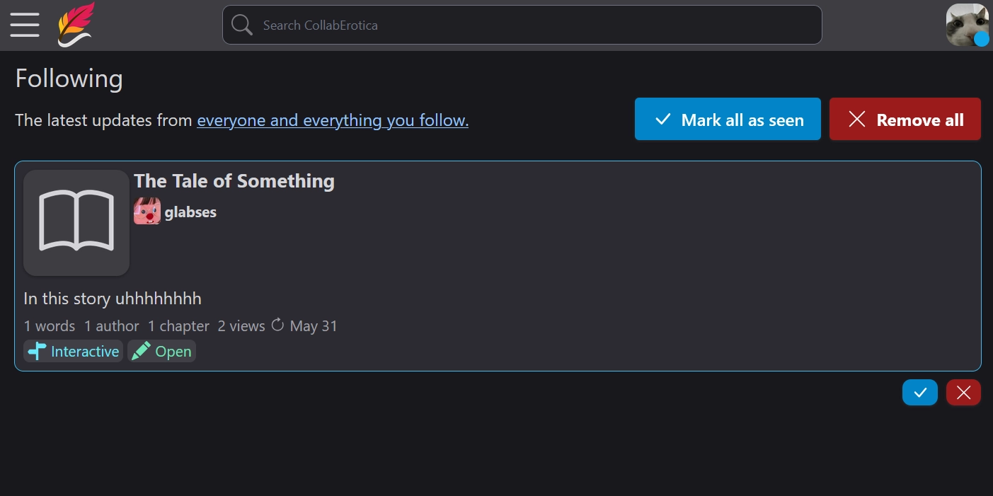
When you click it, (or if you click the blue checkmark below it), the blue highlight will be cleared.

Click the red X (or "Remove All") to get rid of the notification entirely.
Comment Replies
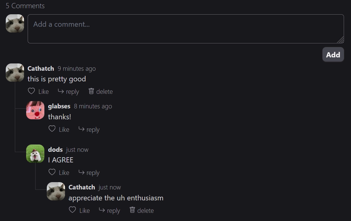
You can now reply directly to comments. Finally!
Choices Tweaks
Each choice now shows how many chapters remain in the story if you follow that choice.
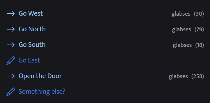
Let me know if this isn't something you want. I might make it configurable for readers or per-story.
Also, a small tweak: the "Something else?" choice will now appear to story owners and editors regardless of whether the "Something else?" choice is enabled. This is to avoid confusion. Previously, if you didn't add any named choices, and you disabled the "Something else?" choice, then no choices would appear on the chapter at all. It would seem like you couldn't add any more chapters.
The "Something else?" choice will still be hidden to normal readers if disabled.
Already particularly fond of the UI/UX. Appreciate the active improvements. Please keep it up.
Neato stuff!
I wonder if there's gonna be a mobile app for this site or not. A mobile app would be nice out of convenience, though.
I like the chapter bracket thing personally. It lets you know where has the most content, and where you can help to fill chapters out if necessary. More transparency \o/